behind the album art with Nicole Rifkin: 'Everyone's Crushed' by Water From Your Eyes
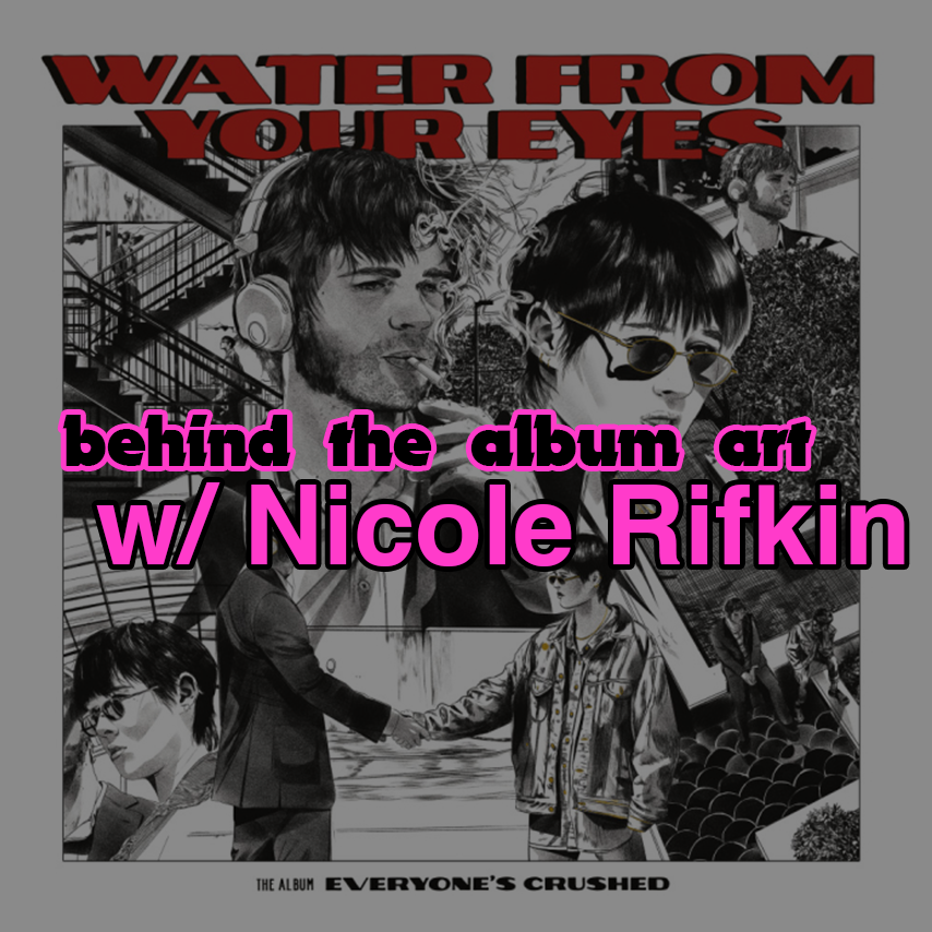
The music you enjoy does not arrive at your ears in a vacuum. In addition to getting nicely composed, recorded, engineered, mixed, and mastered, music has plenty of media accompanying it. Like music videos...and album art! I've already done some interviews with music video makers (most recently with Kyle Garrett, who remote-directed a killer vid for Car Colors, the current recording project of former The Wrens singer/songwriter Charles Bissell), and today on the blog, I'm delighted to present an interview with illustrator and graphic artist Nicole Rifkin.
Nicole's figurative and dynamic editorial illustrations often have a musical bent, whether artwork for the roots music journal No Depression, or a New Yorker cover that's actually a sneaky portrait of Mannequin Pussy's Marisa Dabice. And she's no stranger to doing album art—her illustrations grace the album covers of bands like The New Pornographers, Remember Sports, and Bethlehem Steel. When I saw her tweeting about illustrating the album art for Everyone's Crushed, last year's spiky, freaky, art-rock sensation from Brooklyn duo Water From Your Eyes, I was like...damn this album art really is a vibe...how does this shit actually get made anyway?
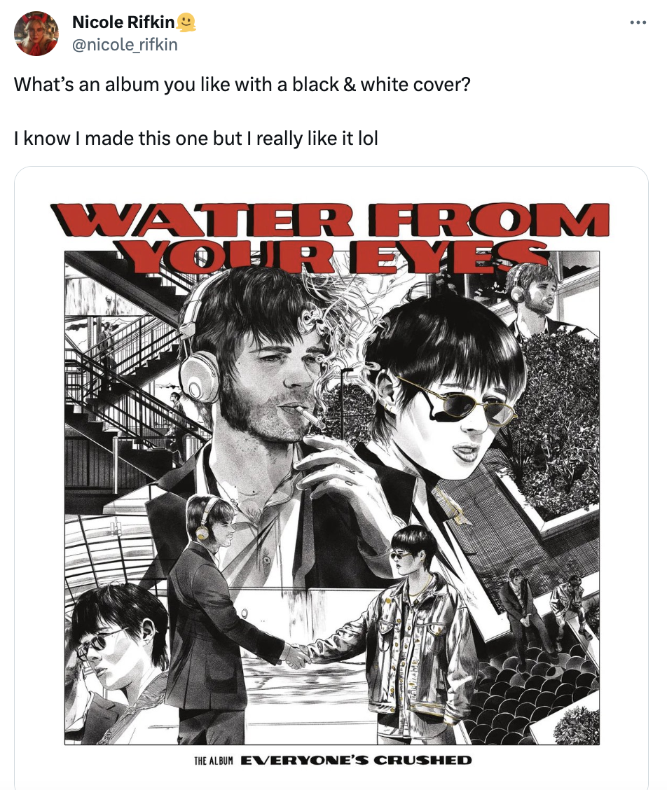
So I emailed some questions to Nicole and she kindly answered them; read on to learn about the behind-the-scenes process of making this delicious album art, getting your first impression of an album while driving, and Nicole's music label "white whale" client...
First of all, the album art is EXTREMELY cool. How did you happen to book this particular gig?
Thank you so much!! I really loved this one. Rachel reached out to me on Twitter about the possibility of doing album art. From what I can recall we were both big fans of what the other does and it made sense to me that it was a good idea to do whatever they wanted to do. I knew of them from their release with Exploding In Sound so I trusted them to have some cool ideas.
Did the band/label have any particular concepts to start with, or were you steering that ship?
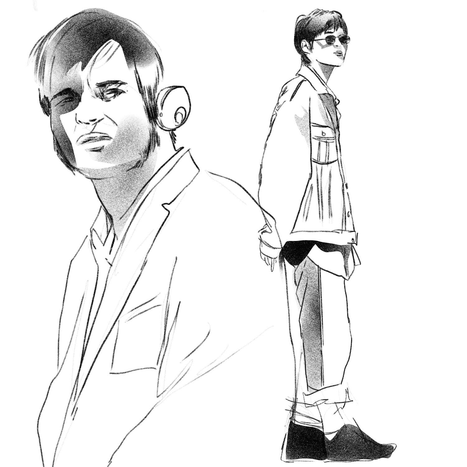
The band knew exactly what they wanted. They liked old Western movie posters. They did a photo shoot for reference [with photographer Ana Fangayen]. I kind of manipulated that into this surreal and somewhat repetitive sequence of what feels like, to me, a heist movie in a mall.
When we had our first meeting with myself, Nikolas (the band’s manager and also nicest person), and the band, they told me that they had signed to Matador. Which, because I’m a nerd, was on my bucket list of labels to work with. I had already done a record for Merge (Titus Andronicus) and this felt like a dream. Sub Pop is my white whale.
They really did let me go ham with the drawings. I took forever making sure it was tight.
Does the album art process generally start with listening to the actual album? If so, what were your first impressions of Everyone's Crushed?
Sometimes. I’ve been up for album art before where I’ve listened to the record and absolutely hated it. It’s nothing personal but I do have very strong opinions on music, and that can throw me out of the ‘I want to make a drawing’ groove.
For this one I absolutely listened to the record first. I put it on in the car and drove around listening to it on repeat for an afternoon. Which I highly recommend!
My job is to figure out where my work and the band’s work intersect and I felt that we all were into some weirdo shit. I think Rachel’s vocals reminded me of Kim Gordon’s in Sonic Youth (with a big nod to them in "Barley"): vulnerable but aloof and cool. The same deal with Nate’s musicianship. It’s overwhelming, sometimes disjointed, and incredibly engaging.
I wanted to make something that you could immerse yourself into like you can with this record. It really lit a fire under my ass to get some cool stuff done.
How long did the art take to create from start to finish?
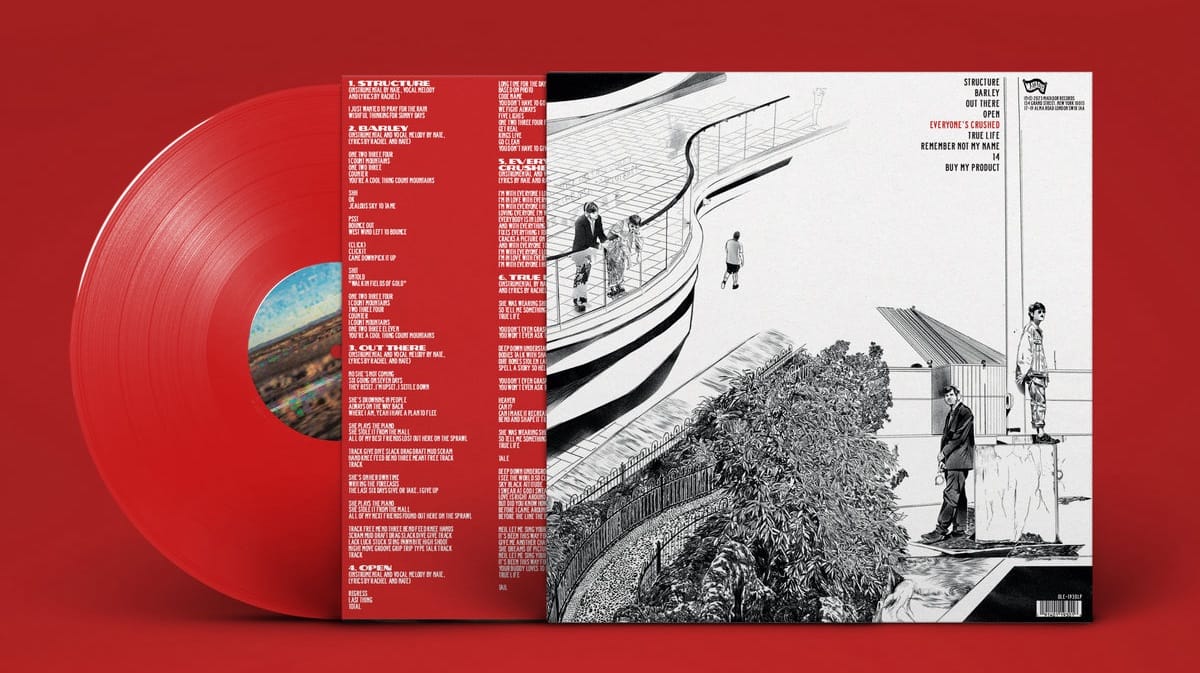
I think that it took about a month. Probably with two weeks straight of just drawing. After that it was making sure everything was balanced enough to pass on for the next part of the design process. Those tiles on the back cover were really labour intensive haha.
Did you encounter any unexpected challenges along the way?
I think not doing the typography was weird for me [Molly Styslinger did the layout design]. In the past I’ve either done that myself or the album has had no typography on it at all. Like when I did the New Pornographers record we decided to only have the name of the band and album on the sticker of the packaging.
This album has a lot of information going on for it, so it’s a testament to how good of a collaboration this project was: everything works together seamlessly. Really great art direction from the band.
I also think that I was really trying to go for something iconic and that made it difficult to get started. Once I got some terrible sketches out of the way I think we really hit our stride.
Have you been able to see the album in its physical form in person? If so, what is it like to see art you created, manifested in this particular way?
I have! I own a copy of it and sent one to my dad as well. I went to a record store, took it to the counter, and bragged to the dude at the register that I made the art. He did not care at all hahahaha.
I think that making album art is the most gratifying thing I get to do. It represents something I love to the world. I want people to pick it up, judge it by its cover, and love it as much as I do.
I do have to say that when I’m not anticipating running into art I’ve made it is incredibly freaky hahaha. It’s like running into your own lost child on the street or something. Like, what are you doing here? I thought I left you on my computer!
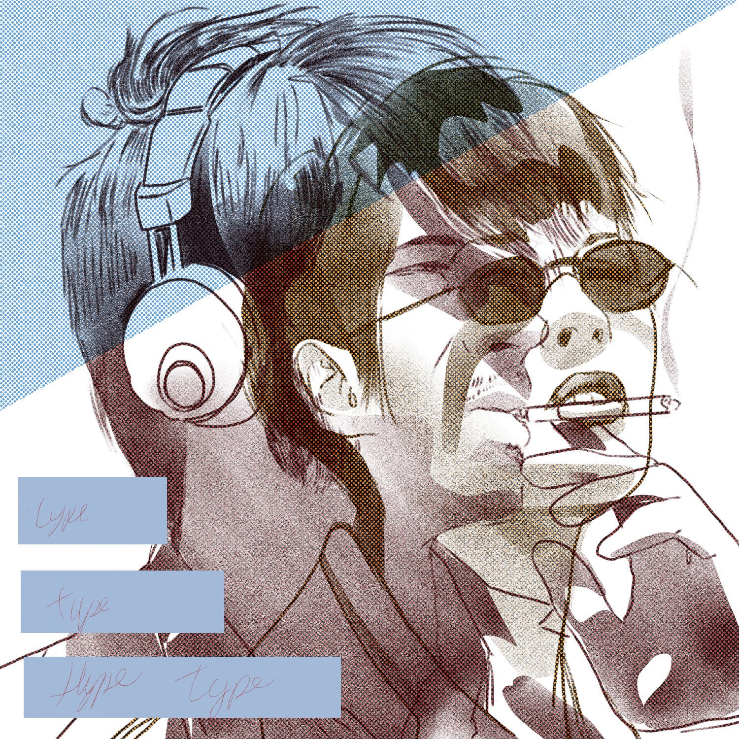
Nicole sent me some preliminary sketches of the art...man the creative process is cool...
Thank you Nicole!! Visit her website to see her vast archive of excellent illustrations. If you enjoy music, you will absolutely enjoy Nicole's art. And thanks for reading I Enjoy Music — if you like it, tell a friend.
